The Complete Guide to 17 Key Principles of Design and How They Can Help You Create a Compelling Design Today


If you’re a designer, whether a freelance graphic designer, web designer or print designer, then you will have to deal with design principles and standards. So what exactly is a design principle? And how can design principles help improve your work? In this article, you will learn about design principles as well as what they are and their importance, and a list of 17 important design principles!
Introduction: What is a design principle?
Design principles are a set of guidelines that help designers create more aesthetically pleasing and functional designs. Design principles are usually not written down formally, but instead, they are learned through observation and practice. This is because there is no one set of design principles that applies to all designs. Every design problem needs its own solution.
Designers can use these principles to make their designs more appealing to the eye and user-friendly the user. Designers can also use them to create a better experience for the end-user, which will in turn increase their satisfaction with the product or service they have been using.
Design Principles Versus Standards — What’s the Difference?
Design principles are general rules that guide the creation of something. They are broad guidelines to help you make decisions about how to proceed with your design. Design principles are more abstract and should be considered first when making decisions about design. For example, contrast is a design principle that can be applied to any element in your website’s design.
Design standard is a rule that must be followed. For example, if you’re designing for the web, there are many standards for how to use colors, fonts, and images correctly. Standards define specific rules for how something should look or be used. For example, the WCAG (Web Content Accessibility Guidelines) are standards that tell designers how to make their websites accessible for people with disabilities.
The Importance & Usefulness of Being Aware Principle for Designers
The importance and usefulness principle is a design principle that focuses on the value and usefulness of your designs. It’s an important principle because it helps you to focus less on aesthetics and more on your customer’s needs.
The Importance and Usefulness Principle — principle states that people will be more attracted to things that are important and useful to them. In other words, if a product or service doesn’t provide enough value for its users, they won’t use it.
As a designer, it’s important to consider what your users want from your product or service. If you don’t think about this before starting a project, you may find yourself wasting time and money on something that no one wants. In other words: Don’t launch until you know exactly what problem your product solves and how it solves it
A lot of designers get caught up in creating something that looks good, but they don’t think about whether or not their product will actually be useful to the end-user. This can lead to frustration because users become frustrated with the product and stop using it altogether. Using this design principle will help you create better products that are actually useful for customers.
17 Key Principles of Design Everyone Should Know
The principles of design are a set of guidelines for creating an effective visual design. They are taught in art classes, and they can be used by anyone who has an interest in design.
The principles of design are often referred to as the “rules” of design, but it’s important to note that these rules are not absolute laws. You can break them, but you should know why you’re doing so and what effect it will have on your work.
The following list contains some of the most important principles of design:
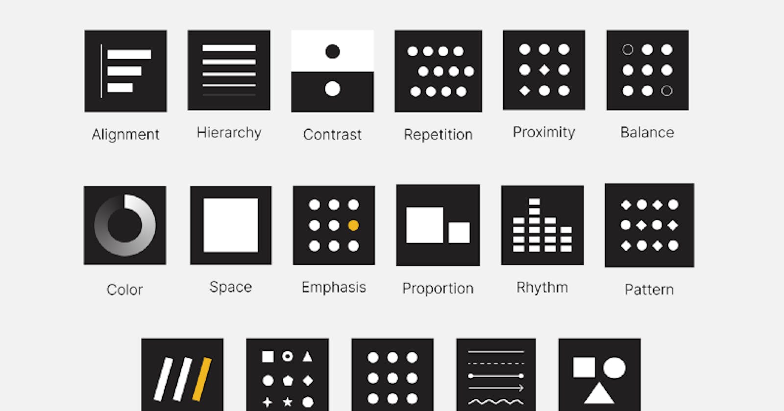
1. Alignment
Alignment is about making sure that elements are aligned properly and consistently. This means that all of your logo’s elements should align with each other and be in the same plane as the logo.
Alignment is one of the most important factors in creating a good design. When content is aligned, it creates a sense of unity and order, which makes it easier for people to scan through your designs and understand what they’re looking at.
2. Visual Hierarchy
You know that feeling when you open a website and see a jumble of text and images? That’s visual chaos. To create visual order, use your design to establish a hierarchy of elements.
Visual hierarchy is the way your website or application uses contrast, size, color, and other factors to give some elements more important than others. You can create a visual hierarchy with color, size, placement (or position), weight, proximity, grouping, and more.
3. Contrast
Contrast is another key principle of design that helps set apart important elements from the rest of the page. It allows users to focus on what matters most without being distracted by other things around it — which is especially important on mobile devices where screens are smaller than desktop monitors and less capable of generating lots of contrast on their own. Contrast also helps guide users through a page by providing visual cues about where they might want to go next (ex: call to action, hyperlinks, likewise).
4. Repetition
Repetition is an element of design that occurs when multiple elements have the same characteristics when compared with each other. It is an easy way to create consistency across a design and can help establish order within a project. To use repetition effectively, make sure you don’t overdo it by varying factors such as size, color, or placement — otherwise, it will seem like you didn’t put much thought into it!
5. Proximity
Proximity refers to how close together or far apart different objects are placed within the same space — and this has an effect on how people perceive those objects: they’re likely to see them as being more related if they’re closer together than if they’re farther apart. This makes proximity an important tool for designers because we want people looking at our designs to see connections between different parts of them.
6. Balance
Balance is the key to making a design look good. It’s what allows you to create visual interest, and it’s the reason why some designs feel off.
To create balance, you have to find a way to balance the elements in your design. The best way to do this is by using negative space (white space) and by making sure your elements are visually similar in size and weight. For example, if you have a large image that takes up much of the page, then make sure that there are at least two other elements on the page that are smaller than it. If all of your elements are large, then people won’t know where to focus their attention because they’ll be spread out across different sizes and weights of objects.
7. Color
The color palette that you choose for your interiors will have a direct impact on how good your room looks. Therefore, it is important that you choose the right colors for yourself so that the overall look is harmonious and pleasing to the eye. You can use pastel colors for bedrooms whereas bold hues are best suited for kitchens and dining rooms. Likewise, neutral colors like white and cream are best suited for living areas and hallways whereas vibrant shades like orange, red or green work well with bold patterns such as floral prints or geometric prints on rugs, curtains, or upholstery fabrics in bathrooms and dining rooms.
Contrasting colors are often used to create balance in a design. While dark colors recede from view and light colors come forward, there are times when both dark and light colors need to be used together. By pairing them carefully, you can create a balanced look.
8. Spacing/Negative Space
Spacing is another one of those things that makes a big difference in how your design looks, but it’s also one of the hardest things to get right. The key thing here is negative space — white space between elements — which helps draw attention to certain parts of your design while making others recede into the background.
9. Emphasis
Setting aside the fact that a color is a powerful tool for communicating messages, it should also be used to emphasize important elements of a design. This is why you see so many websites using red and white on their home pages to convey the feeling of urgency. The best part about this technique is that it’s not just a trick — it works!
10. Proportion
Proportion is one of the most important principles in art and design because it affects every other aspect of your work. If your designs have poor proportions, they will look unbalanced and unnatural. On the other hand, if your designs have good proportions, they will look balanced and natural (even if they’re abstract).
11. Rhythm
Rhythm is a pattern of repetition or variation in any kind of art form. Rhythm is characterized by a regular recurrence or pattern in time. It can be found in all forms of life, from music to poetry, from painting to architecture. In art and design, rhythm is created by varying the length, width or shape of elements in your composition.
12. Pattern
Patterns are repeating visual elements used to create order and unity within a composition. Patterns can be used as an element on their own or as an accent within another pattern. In general usage, a pattern is repeated at regular intervals throughout an area or surface for decorative effect. There are many types of patterns: stripes, checks, circles, and dots are just some examples!
13. Movement
We all know what movement means — it’s when something changes position over time! But how do you represent movement in your designs? When designing websites or mobile apps. Movement is created when a viewer sees elements moving around in composition (or across multiple compositions). Movement can be created by overlapping shapes or stacking elements on top of one another (like overlapping apples).
14. Variety
The number one rule of design is variety — you want to give people options so they can find something they like or will use. Variety helps people get what they need from your design in the way they want it — no more scrolling through pages of choices trying to find one item that fits all of their needs! If you only have one option available, then they’ll have to adapt themselves to fit into that one option rather than getting what they need out of it.
15. Unity
Unity means using similar elements in one design so that all the content makes sense together. For example, if all your text is blue with white backgrounds then a visitor will know where to look first when they enter your site because they’re already familiar with those colors and fonts from other areas of your site. If you change the font color to red or yellow then it will disrupt the unity because they don’t know where to look first anymore!
16. Line
The line is another important element used in creating a design because it creates depth and allows viewers to see how things are related spatially. Lines can be straight or curved, thick or thin, but they must all be consistent throughout your project so that viewers can easily read them from a distance or close up without having to focus on them too closely.
As an example, when you look at a painting or drawing, you can see how the artist used lines to create depth and perspective in his work. The artist will start by drawing one line going from left to right and then continue by adding more lines until he achieves the desired effect of depth and perspective within his work of art.
17. Shapes
A shape is any closed area on a flat surface that encloses an area and has a boundary formed by straight lines (circles are closed areas). Shapes are built from lines, curves, and angles. They have volume and weight even though they do not have mass like solid objects do; this makes them ideal for representing objects in art because they can be easily manipulated without changing their appearance too much (e.g., you can make them smaller or larger without affecting their shape).
As you can see, there are a lot of principles of design out there. While we highlighted 17 key principles above, there are even more that we didn’t touch upon. However, the ones above are definitely some of the most important ones to be familiar with. And if you consider the rest secondary, they’ll all help you ace your next design project.
Check out my latest blog on How Design Thinking Can Help You Create Better UI/UX Designs
If you have read this far, I really appreciate it. Hope this blog n helps you find your perfect mentor. Do give a follow to get to know more about such insights. Do share your valuable opinion or other blog topic suggestions, I appreciate your honest feedback!
Connect With me on Twitter | LinkedIn | Instagram | Hashnode